Labels must be attractive enough to attract any customer interested within a few seconds. When you pass by an aisle in the supermarket, you do not look at every item carefully, and any label takes only a few seconds to get attention, which will result in the customer picking up the product and then purchasing it.
Creative and compelling labels are the key to success, but they can also become the recipe for disaster if you do not use them wisely and strategically.
How do you use color effectively in beer label design?
Here are five key factors that will make the label more attractive, without causing color confusion.
Consumers relate to some color techniques which can impact the final decision. However, you must know how to use the colors effectively to create the results that bring more sales and a better brand identity.
Key Factors for Using Color Effectively in Beer Label Design
The manufacturers must decide what kind of feeling they want to convey with their products. A bright color pallet with reds and oranges will give consumers a hot and fiery feel. On the contrary, blues and greens provide a calming and soothing effect.
What kind of feeling does your product want the consumers to experience?
For beers, you may have seen cool blue for lager, which instantly takes consumers to a calm evening when they can enjoy a cold lager with a dark sky to view. Black label can denote class, coolness and an elegant mood.
Here are the factors you should consider for your brand:

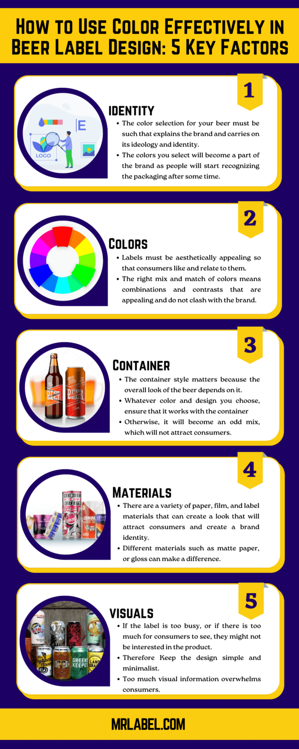
Identify the Characteristics:
What kind of brand do you want to promote? Is it a friendly cold beer that you can enjoy with friends on the beach? Or is it an elegant, bottle-packaged beer that is supposed to be served chilled?
In both cases, the color selection for your beer must be such that explains the brand and carries on its ideology and identity. The colors you select will become a part of the brand as people will start recognizing the packaging after some time.
Mix Colors Appropriately:
Labels must be aesthetically appealing so that consumers like and relate to them. Some people try out a new flavor or a new product only if they like the color, or if they think the label looks cool.
Your beer brand will look good if the label uses all the colors you have in mind in an aesthetic way. The right mix and match of colors means combinations and contrasts that are appealing and do not clash with the brand.
For example, if your larger brand name is Dark Scot, you should use cooler colors instead of yellow, and red! Similarly, a brown glass bottle with a green cap can sport a yellow and red label.
A color wheel can help with color selection, which works well together. Similarly, if you want suggestions with colors, look at natural pallets like sunset hues, or late evening sky tones and you can get plenty of inspiration.
Many beer brands stick with a single-color label, which is bright and displays the brand name clearly. This technique will also be helpful as long as you are sure that your brand needs it.
Container Consideration:
Is the beer in a tin can or a bottle? The container style matters because the overall look of the beer depends on it. A label design might look fabulous on a bottle but on a cylindrical can it will look odd. Some color schemes can suit tin cans while they might not complement the glass bottles.
Whatever color and design you choose, ensure that it works with the container otherwise it will become an odd mix, which will not attract consumers.
Selecting Materials:
When designing labels, many manufacturers and creative teams look at the ink as a deal breaker, but there are other factors as well. There are a variety of paper, film, and label materials that can create the look that will attract consumers and create a brand identity.
Different materials such as matte paper, or gloss can make a difference. Moreover, if you want the logo or name of the brand to be visible in bright colors, you can select a subtle background to do the job. Clear labels help emphasize the container, so if that is part of your plan. Holographic films can create a contrast that will make the label flashier.
Too Much is Too Bad:
If the label is too busy, or if there is too much for consumers to see, they might not be interested in the product. For labels, a minimalist approach will be a winner. Many people think the brand is trying to convince them that there are too many things on the label.
While we disagree, try to keep the label simple so that the consumers can see what the product contains and what it has to offer. A busy design will often result in consumers returning the product, and we do not want that.
Last Words
When designing labels for beers, how will colors effectively help? We have discussed the top factors that contribute to better label design. Beer designs begin with the right color selection and design, which will be attractive to consumers.
Whenever customers pick up any beer from the shelf or refrigerator, they spend a few seconds deciding if they want to purchase it. By following these key factors, you can ensure a better label that will result in higher sales and a good brand identity.


