What’s the Difference Between Typography, Typeface, and Font?
Walk into any branding meeting and you’ll hear the words typography, typeface, and font used like they’re interchangeable.
They’re not, and if you’re in packaging, labels, or print production, knowing the difference isn’t just trivia. It directly impacts how your product shows up on the shelf.
Here’s how to think about it.
What Is Typography?
Typography is the big-picture strategy.
It’s the art and science of arranging type so it communicates clearly and looks intentional. That includes decisions around hierarchy, spacing, alignment, scale, and how text interacts with color and imagery.
Typography answers questions like:
- What should the customer read first on this label?
- How do we make compliance information readable without overwhelming the design?
- Does the type reflect the personality of the brand?
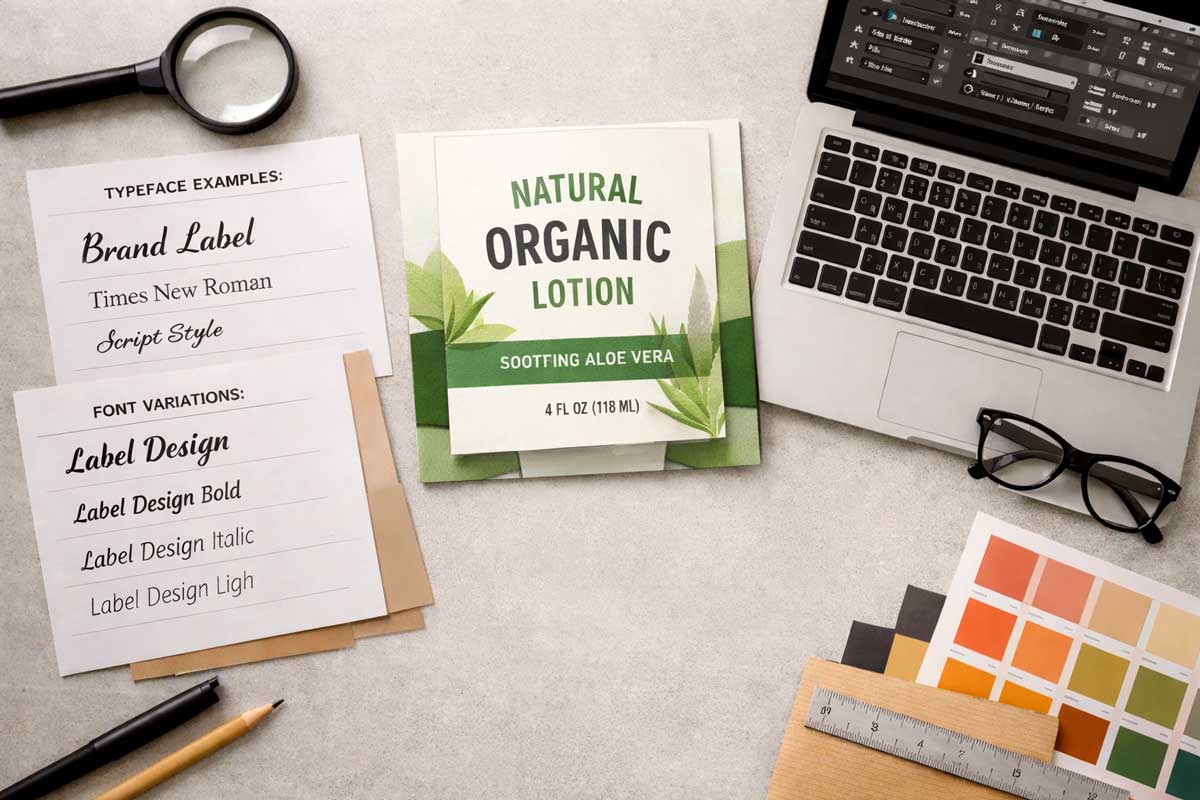
What Is a Typeface?
A typeface is the design of the letters themselves.
You can think of it as a family of related letterforms that share a specific look and feel.
For example, Helvetica is a typeface known for its clean, modern lines. Times New Roman is another typeface, recognized for its more traditional, serif design.
Each typeface has its own personality. Some feel bold and industrial. Others feel elegant, playful, or authoritative. On a label, that personality influences how your product is perceived before a customer reads a single word.
Choosing a typeface is a branding decision and signals who you are.
What Is a Font?
A font is a specific variation within a typeface.
It includes particular attributes such as weight, size, and style.
If Helvetica is the typeface, then Helvetica Bold 12pt and Helvetica Light 10pt are fonts.
In practical terms, fonts are the working tools designers and prepress teams use to execute the broader typographic strategy. When your artwork file specifies a certain font, it’s locking in a very specific version of the typeface so that what you approved on screen matches what comes off the press.
That precision matters in label production. A missing font or incorrect version can change line breaks, spacing, and readability, especially in tight layouts with regulatory copy.
Why This Distinction Matters in Label Design
On a crowded retail shelf, typography shapes how fast a shopper processes information.
A well-chosen typeface builds brand recognition. The correct font selection protects consistency across SKUs, sizes, and reprints.
For manufacturers and brand owners, that translates to:
- Stronger visual identity
- Better readability for compliance text
- Fewer production errors
- A more cohesive product line
At M&R Label, understanding these distinctions is part of delivering labels that don’t just look good, but perform well in the real world.
If you’re reviewing your packaging and something feels “off,” it might not be the colors or graphics. It might be the type.
Ready to Start Your Label Project?
Our team of experts is ready to help bring your vision to life.
Request a Quote