Making Cannabis Labels Readable with Fonts and Real-World Testing
Cannabis products often come in small packages—tinctures, pre-rolls, vapes—and the label must carry more weight than its size suggests.
Regulations require key details like dosage, ingredients, THC/CBD content, and safety warnings. At the same time, consumers look for clarity and confidence when choosing a brand.
That’s why font selection and label testing are so critical.
Why Readability Matters in Cannabis Labeling
Clarity is not optional in this industry.
If dosage or warning text is difficult to read, the risks range from regulatory setbacks to customer frustration. A striking design can capture attention, but it loses impact if the information is buried in hard-to-read text or gets lost under dispensary lighting.
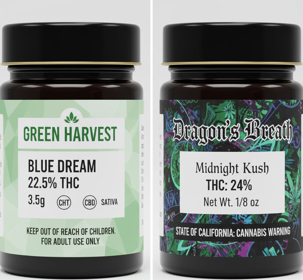
Choosing Fonts That Work
Fonts influence how quickly and clearly information is absorbed. For cannabis labels, the following practices can make a difference:
- Build consistency: A unified font approach across all product lines strengthens brand recognition and speeds up consumer recognition.
- Maximize contrast: Light text on dark backgrounds or dark text on light backgrounds is easiest to scan quickly.
- Organize with hierarchy: Use larger or bold type for dosage and warnings, while supporting details can remain smaller but still clear.
- Prioritize legibility: Simple, clean fonts like sans-serifs tend to hold up better than decorative or ultra-thin styles.
Testing in Real Conditions
A design that looks sharp on screen doesn’t always hold up in use.
Testing labels across conditions helps avoid issues before products reach dispensaries.
- Compliance audits: Every piece of information required by law must not only appear but remain legible after storage and use.
- Durability: Smudge resistance is essential, especially for labels that may face moisture, oils, or repeated handling.
- Scaling: Small bottles demand tiny text; fonts need to stay crisp when reduced.
- Lighting checks: Labels should be reviewed in dim and bright settings to confirm readability.
Designing With Consumers in Mind
Readable cannabis labels influence the buying decision, reinforce trust, and reflect how much care a brand puts into its products.
When a consumer sees clear instructions, ingredients, and contact information, they feel confident about what they’re purchasing, and confidence is what creates loyalty.
As the cannabis market continues to grow, labels will play an even bigger role in building consumer trust. Fonts and real-world testing might seem like minor design choices, but they often decide whether a product feels professional and dependable or gets passed over for something clearer. A label that’s easy to read not only meets compliance standards but also helps a product stand out on crowded dispensary shelves.
Ready to Start Your Label Project?
Our team of experts is ready to help bring your vision to life.
Request a Quote